GLA 4
Kitchen remodel in Friedrichshain, Berlin: transforming an apartment with an architect's expertise.
Kitchen remodel
35 qm | Berlin | Friedrichshain | 2020
Scope of work:
Partners:
Photography by:
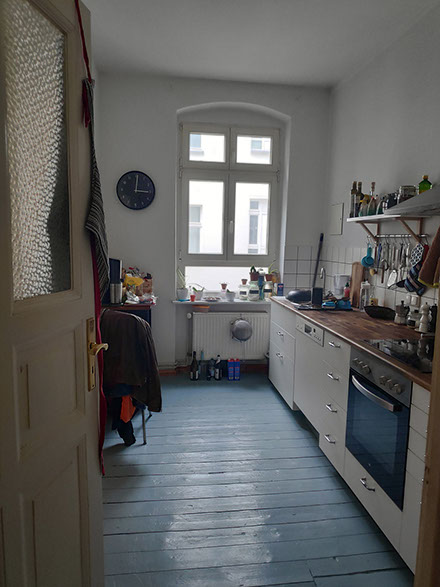
Julia and Mathieu are a couple, who have lived in Friedrichshain, Berlin for several years. Although they loved their apartment, they were never satisfied with their kitchen and dining area. Although the space was large, it felt cramped. There were many doorways and it was difficult to make it functional. Counter space wasn’t big enough, and it was difficult to find enough room for all of their kitchen utensils. Julia and Mathieu are wonderful people who radiated warmth and welcome but the gloomy kitchen did not do justice to their personalities. That is why they reached out to me, hoping that an architect would help them better plan their kitchen remodel.
Julia and Mathieu are a couple, who have lived in Berlin-Friedrichshain for several years. Although they loved their apartment, they were never satisfied with their kitchen and dining area. Although the space was large, it felt cramped. There were many doorways and it was difficult to make it functional. Counter space wasn’t big enough, and it was difficult to find enough room for all of their kitchen utensils. Julia and Mathieu are wonderful people who radiated warmth and welcome but the gloomy kitchen did not do justice to their personalities. That is why they reached out to me, hoping that an architect would help them better plan their kitchen remodel.

Design guidelines for kitchen remodel:
– create more counter-top space
– create more storage space in the kitchen
– create the storage space in the hallway for shoes and coats
– find a place for bigger sink
– find a solution for the window in the kitchen
– use the whole hight of the room, but at the same time not everything should be box out
– create space for utility storage
The Challenge: A Functional and Cozy Space
After taking a good look at the original design I realized that even though there were 3 wide and tall windows that brought in ample natural light, the entrance to the apartment was a dark hallway because all the walls would not allow the light to penetrate the interiors. Upon further inspection, I found that the gallery-type kitchen layout wasted a lot of the potential of the apartment and was lacking in both counter-top space and storage, and cooking in this kitchen made them feel isolated because of all the barriers between them and the rest of the apartment.
With those observations, I started working on a new design that would help alleviate their problems. I proposed to remove all of the walls and doors that were congesting the space and create subtle thresholds to visually separate different areas of the kitchen without adding additional walls or doors. Extending the space became one of my key initiatives as I approached the renovation. This was achieved through using different flooring materials, and carefully arranging furniture.
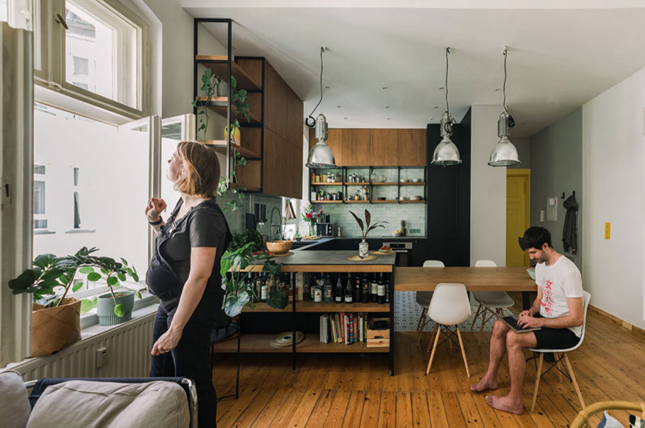
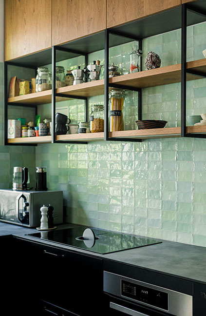
.The new U-shaped kitchen layout multiplied the work surface and storage space, and I added a 4-seater dining table for a more seamless flow of interactions between the kitchen, dining, and living areas. Creating a height difference in the ceiling to mark the threshold between the kitchen and dining area,
Before
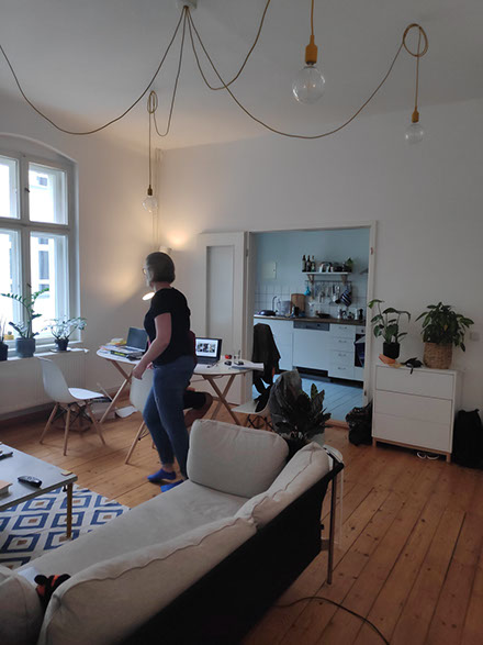
Solutions for a more functional and cozy space.
After taking a good look at the original design I realized that even though there were 3 wide and tall windows that brought in ample natural light, the entrance to the apartment was a dark hallway because all the walls would not allow the light to penetrate the interiors. Upon further inspection, I found that the gallery-type kitchen layout wasted a lot of the potential of the apartment and was lacking in both counter-top space and storage, and cooking in this kitchen made them feel isolated because of all the barriers between them and the rest of the apartment.
With those observations, I started working on a new design that would help alleviate their problems. I proposed to remove all of the walls and doors that were congesting the space and create subtle thresholds to visually separate different areas of the kitchen without adding additional walls or doors. Extending the space became one of my key initiatives as I approached the renovation. This was achieved through using different flooring materials, and carefully arranging furniture.
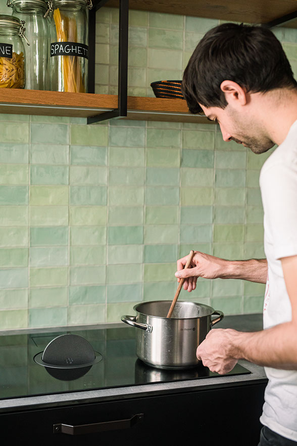
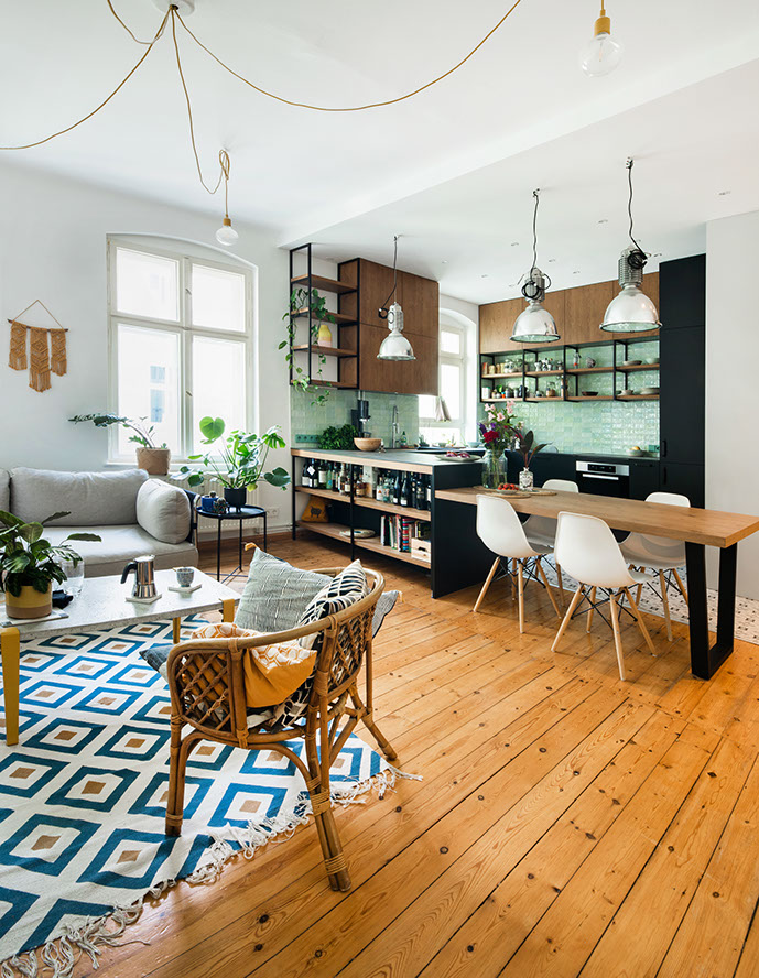
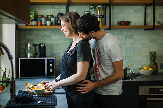
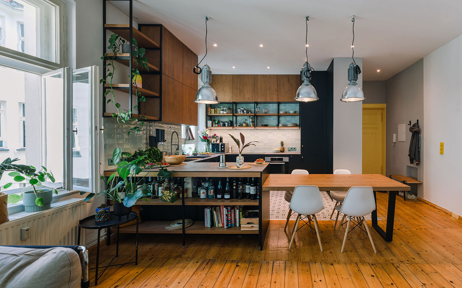
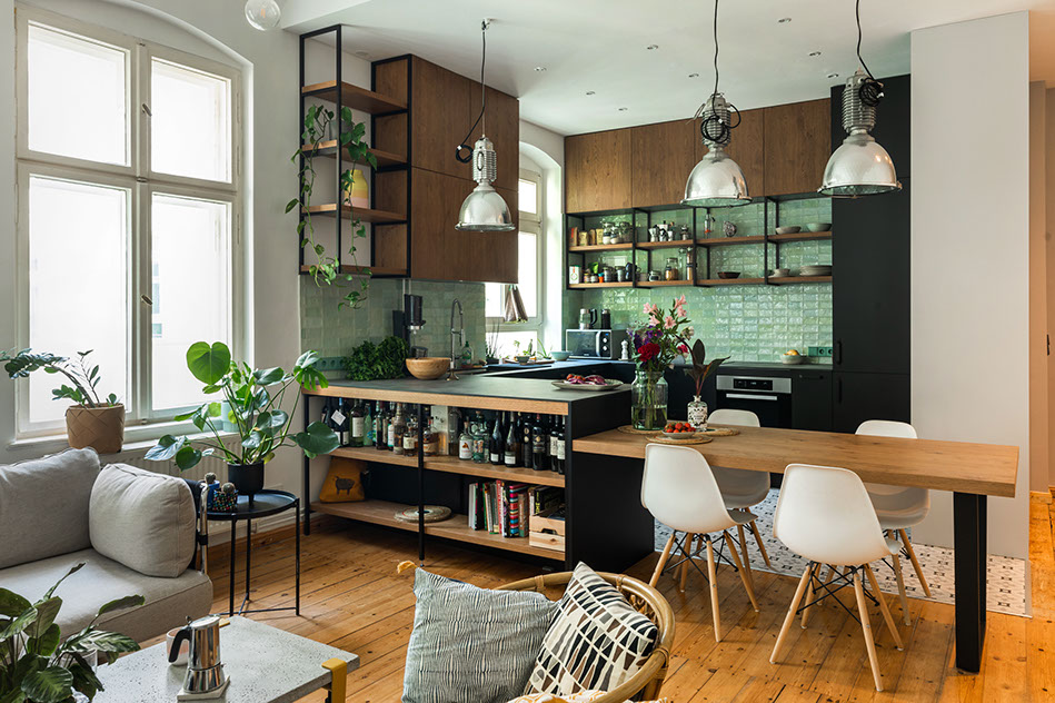
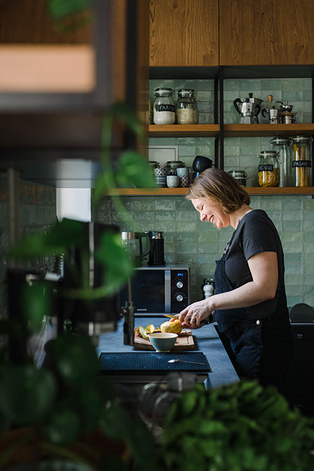
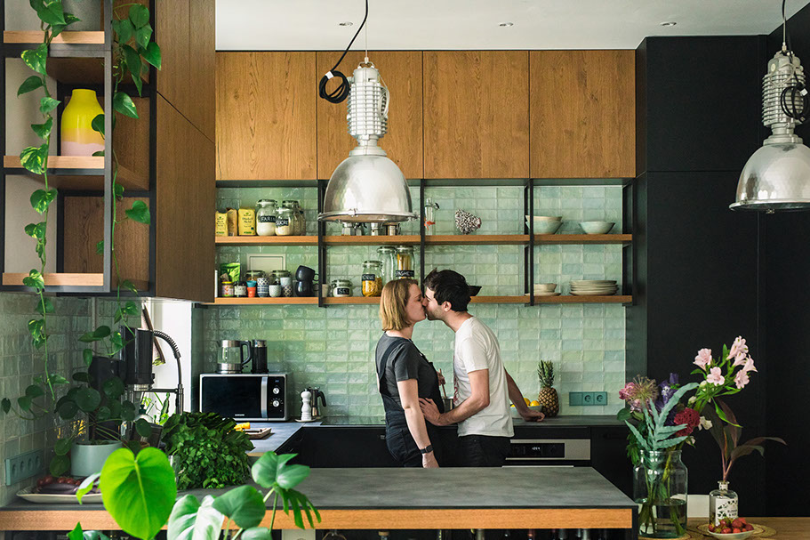
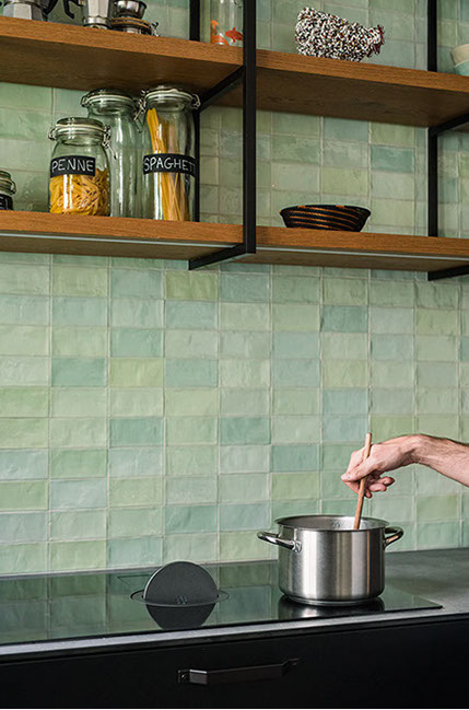
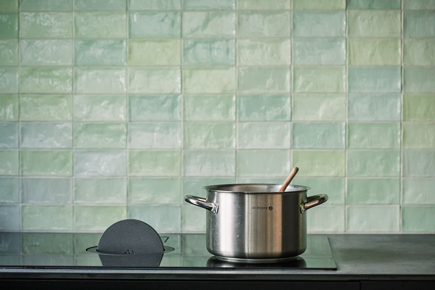
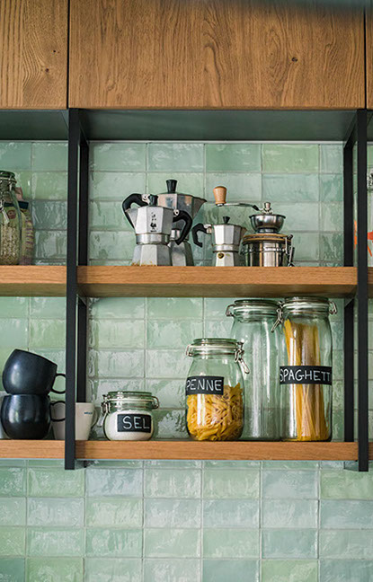
I also wanted to enhance the personality and individuality of Julia and Mathieu’s home, so the original grey timber flooring typical for Berlin was replaced with vibrantly coloured, patterned tiles that not only helped to further demarcate the space but also added a touch of excitement. The pantry cabinets were redesigned with clean geometries, with black and timber tones. The dining table matches the same tones of timber and steel to match the language of the cabinets, thus creating a relaxing and welcoming atmosphere. The backsplash for the counters is a pastel green glossy tile in a combination of 6 different subtle shades. This tile was chosen as it is easy to clean and maintain, and the colours complement the modern and sleek black and warm timber tones of the pantry cupboards.
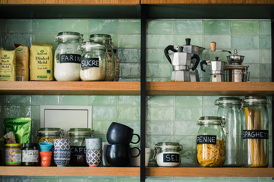
To create additional storage space, I added built-in wardrobes in the hallway for shoes and coats. I also found a solution for the window in the kitchen by using the whole height of the room without boxing out the space. This added additional storage space for utensils and other kitchen items.
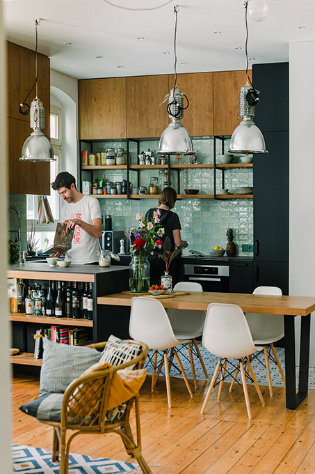
From my experience working as an architect, I knew that remodelling the apartment by opening up the kitchen wall would transform the apartment unimaginable way , and I was right! Now the space feels extended and visually connected, which encourages interactions and optimizes work-life balance. The previously cramped apartment is now a beautiful open space with a functional kitchen, integrated dining, and an entry zone created by a built-in wardrobe. The result is a space that is not only functional but also inviting and cozy. The personality of Julia and Mathieu is enhanced through the careful selection of furniture and accessories, transforming their apartment into a warm, bright and welcoming home for a growing family.

Design guidelines for kitchen remodel:
– create more counter-top space
– create more storage space in the kitchen
– create the storage space in the hallway for shoes and coats
– find a place for bigger sink
– find a solution for the window in the kitchen
– use the whole hight of the room, but at the same time not everything should be box out
– create space for utility storage


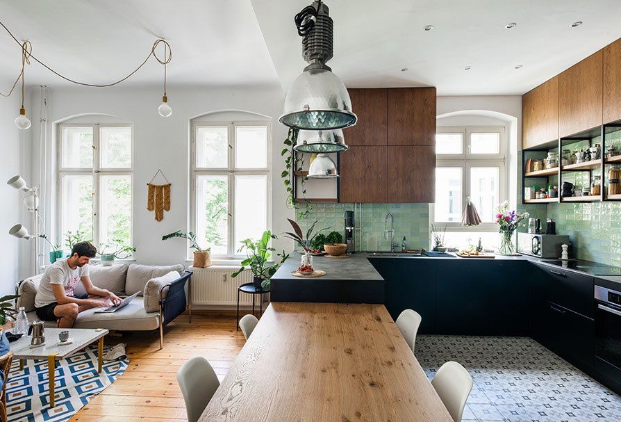
Before and After: A Kitchen Transformed


The Solution: Opening Up the Space
I also wanted to enhance the personality and individuality of Julia and Mathieu’s home, so the original grey timber flooring typical for Berlin was replaced with vibrantly coloured, patterned tiles that not only helped to further demarcate the space but also added a touch of excitement. The pantry cabinets were redesigned with clean geometries, with black and timber tones. The dining table matches the same tones of timber and steel to match the language of the cabinets, thus creating a relaxing and welcoming atmosphere. The backsplash for the counters is a pastel green glossy tile in a combination of 6 different subtle shades. This tile was chosen as it is easy to clean and maintain, and the colours complement the modern and sleek black and warm timber tones of the pantry cupboards.
To create additional storage space, I added built-in wardrobes in the hallway for shoes and coats. I also found a solution for the window in the kitchen by using the whole height of the room without boxing out the space. This added additional storage space for utensils and other kitchen items.
From my experience working as an architect, I knew that kitchen remodel by opening up the kitchen wall would transform the apartment unimaginable way, and I was right! Now the space feels extended and visually connected, which encourages interactions and optimizes work-life balance. The previously cramped apartment is now a beautiful open space with a functional kitchen, integrated dining, and an entry zone created by a built-in wardrobe. The result is a space that is not only functional but also inviting and cozy. The personality of Julia and Mathieu is enhanced through the careful selection of furniture and accessories, transforming their apartment into a warm, bright and welcoming home for a growing family. Julia and Mathieu successfully transformed their apartment by utilizing an architect’s expertise to create a more functional and stylish space.


In need of renovation?
GET IN TOUCH!
If you’re looking to collaborate, we’re all ears and excited to delve into the details of your project or business.
We speak English, German, and Polish.